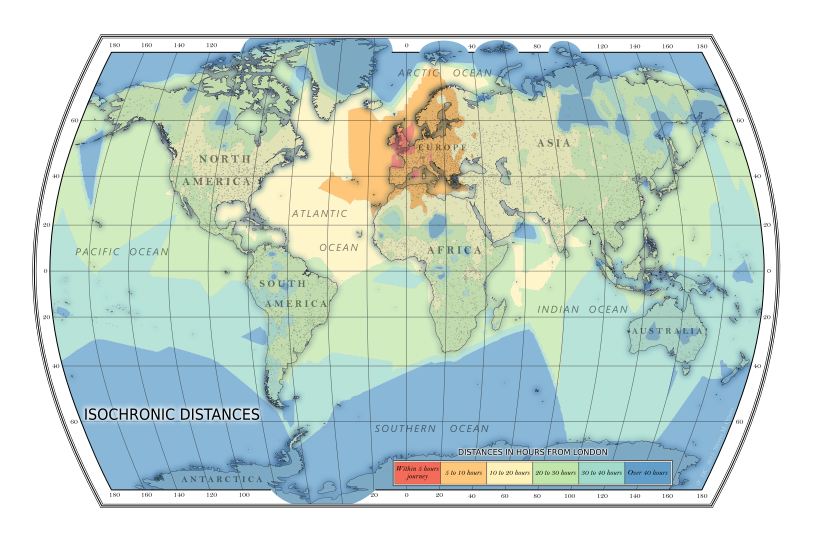
Bartholomap project
The map below, the 'Bartholomap' shows how long it takes from London to any place in the world. This page tells the story how I came to make the Bartholomap. For the technical details and code I refer you to the GitHub repository. If you have any questions feel free to contact me.

The isochronic map created by me showing various travel times from London in 2015 - CC-BY Steven M. Ottens
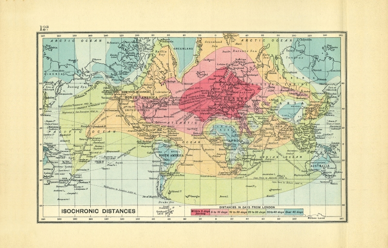
John George Bartholomew's map
menu
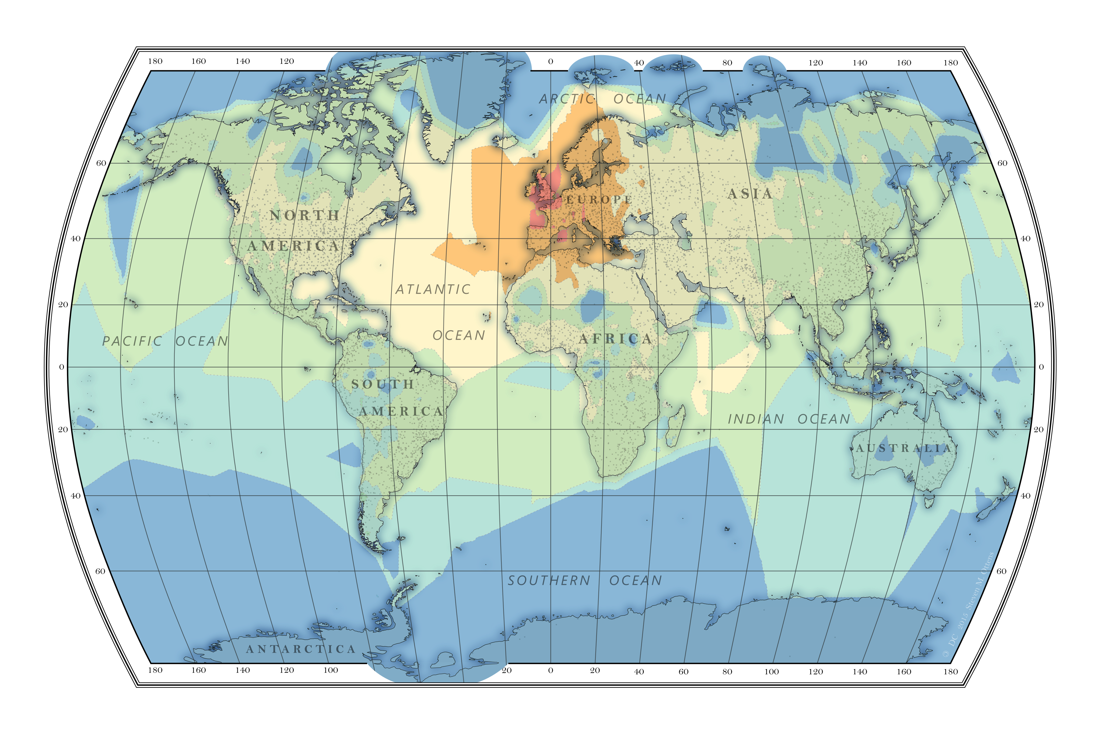
A while ago I read an article in Intelligent Life about a hundred year old map that showed how long it took to travel from London to anywhere on the globe. The map, made before airtravel was common, shows the influence of shipping routes and intercontinental railways. Within a month you could travel to all but the most remote and landlocked places.
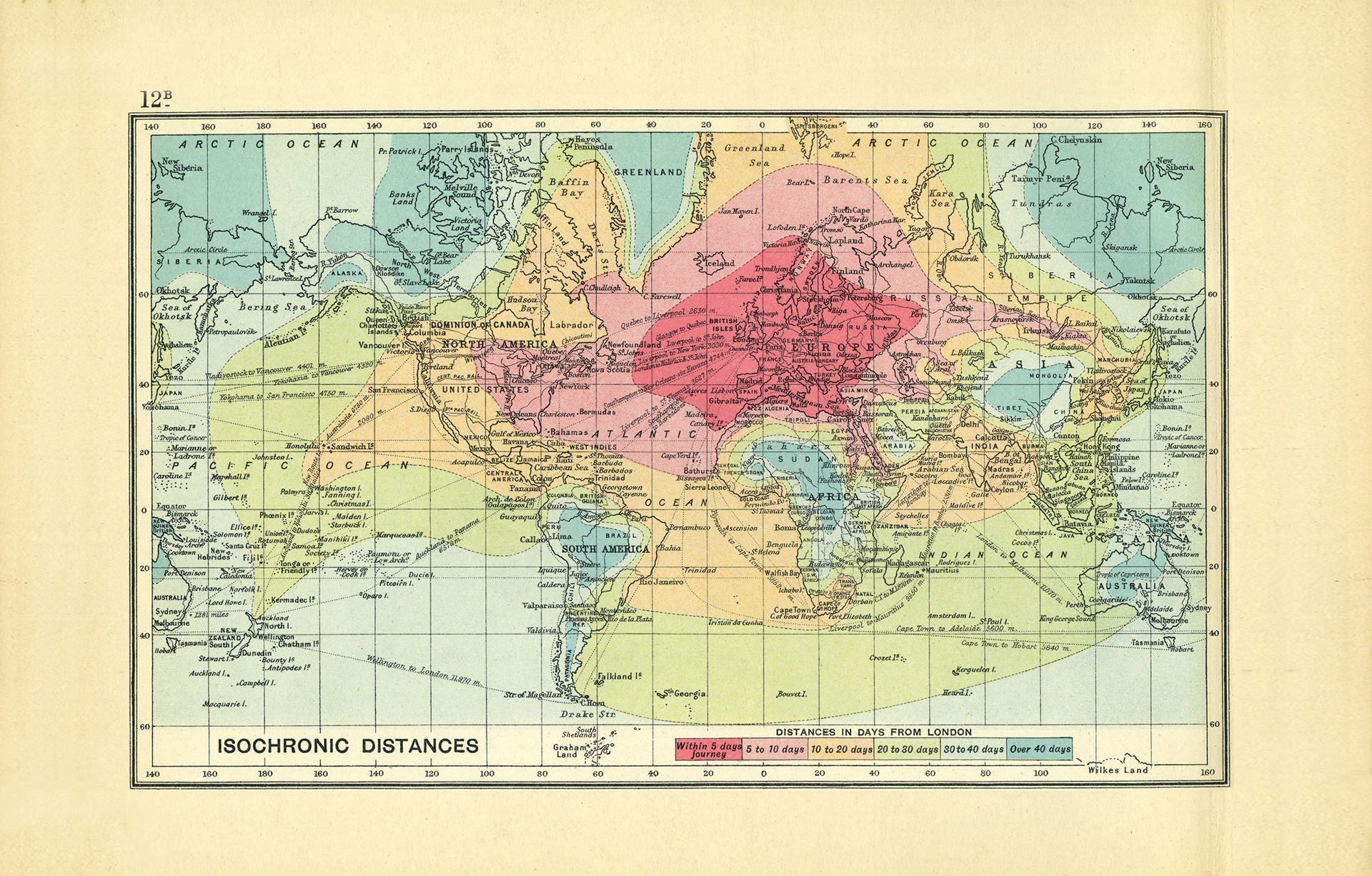
An isochronic map created by John George Bartholomew showing various travel times from London in 1914 Photo: RGS/Intelligent Life
Air travel map
menu
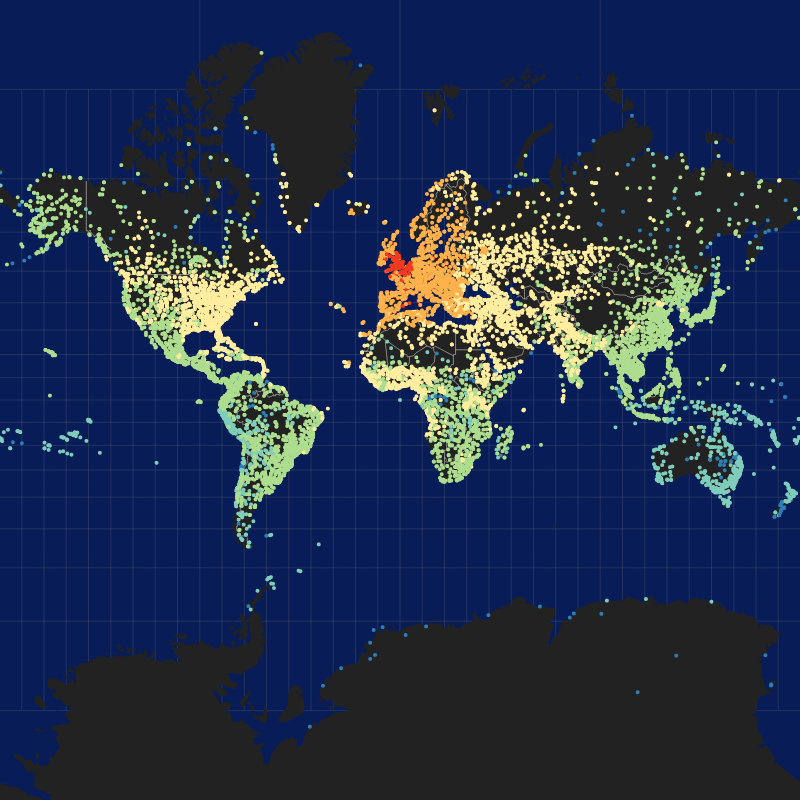
Since that map was created the world has changed, and I was wondering how such a map would look like if it was created today. Since airtravel is the popular choice for long distance travel I decided to start with that. The OpenFlights project provides a list of airport-locations and flight-routes. Taking London as a starting point and using 600km/h as travelspeed it was fairly easy to calculate the time it takes to get to each of the ~3000 airports in the list. TBD: link naar github. Since contemporary travel is so much faster I changed the scale from days to hours:
within 5 hours5 to 10 hours10 to 20 hours20 to 30 hours30 to 40 hoursover 40 hours

Map of all airports as ±3000 dots classified by travel time (left) and as isochronal lines (right)
Enhance with actual destinations
menu
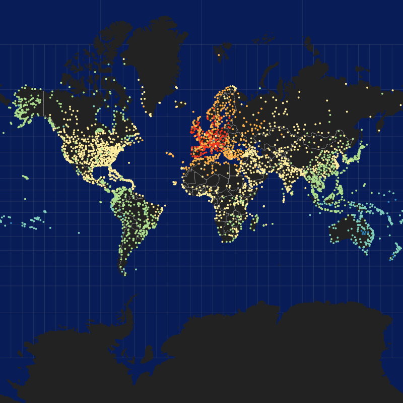
However as any traveler knows, being at the airport doesn't mean that you have arrived. To further the resolution of the isochronic map I used the 7000 places from Natural Earth Data to calculate the travel time to actual places. For each place I looked up the nearest airport and within a radius of a 1000km the nearest nonstop, one-stop and two-stop airports. For all four airports I calculated the total traveltime from London via that airport to the destination. This was done by using the excellent Open Source Routing Machine.

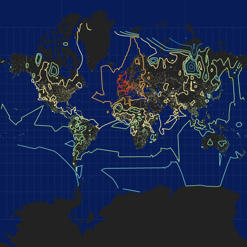
Map of all airports and routable places as ±10350 dots classified by travel time (left) and as isochronal lines (right)
As the crow flies
menuFor about 190 places which did not get a result from the previous exercise, I decided to divide them into landlocked and coastal cities. (This could be done way more advanced, but I just looked on the map and made a judgement call). For both types of places I calculated the straight line distance (using great arc distance) and decided upon 5km/h as landspeed and 25km/h for water. This may sound slow, but this is 'as the crow flies' in terrain without roads. Boats obviously are less hindered by the lack of roads.
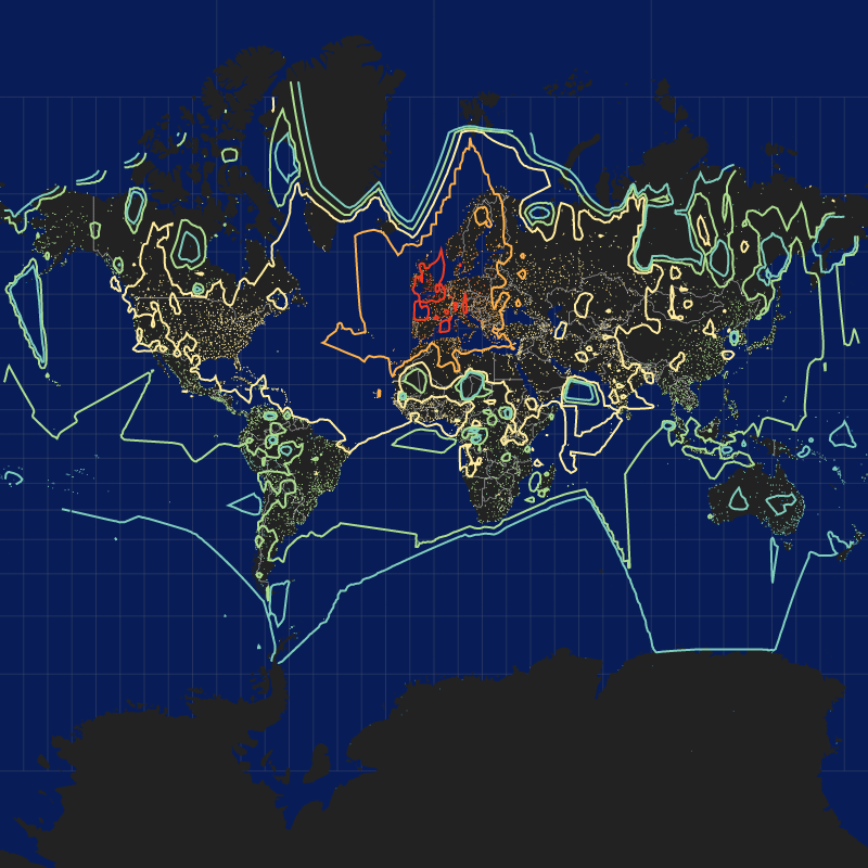
Map of all airports and places as ±10500 dots classified by travel time (left) and as isochronic lines (right)
Manual labour
menuThis is as far as the automated process can go. John George Bartholomew created his map by hand, and to reimagine his map I'll have to do some handwork myself. The isochronal lines generated by turf.js are lines and not nicely closed polygons with holes. With some QGIS magic I created the necessary polygons which I then could load into Inkscape to create the map but also load into MapBox Studio to create the slippy map below.
Thanks to the kind folks of the Spatial Community for their inspiration and help, the Open Flight and Natural Earth communities for their data and my wife for the original suggestion to create this map.